This is a guest post by Tim Ware.
Although the rollout of Timeline met with a lot of resistance from those used to the previous interface, over time we’ve all realized that it offers much more control over the visual branding of pages than ever before.
I am not alone in not being pleased with the new way that comments on pages from non-admins are marginalized from the main content of the page, positioned well below the fold in the right column under the heading “Recent Posts by Others on [page name].” And there’s no other option. I consider this the biggest drawback with the Timeline layout, followed closely by no longer being able to set a default landing tab for non-fans.
However, in this article, I will focus on the three visual elements over which you have total control on your Timeline Page.
- The Cover Photo — the 851 x 315px image at the top;
- The Profile Picture — the inset 160 x 160px (plus a 5px white border) image that also serves as your brand’s icon when posting or commenting as your Page;
- Custom Tab Images — the (maximum) four 111 x 74px buttons below the Cover Photo that link to your tabs;
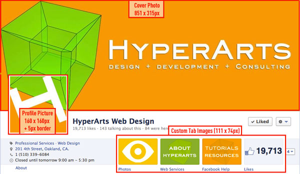
Using a smart and creative approach to the above elements can result in great visual branding that will make your Page more compelling and Like-able!
The Cover Photo — Make it Well Designed & Informative!
The Cover Photo image you use for your Page will be your Page’s first impression, so you DON’T want to waste it!
Make sure the imagery supports your brand and, along with concise text, conveys your brand’s essence.
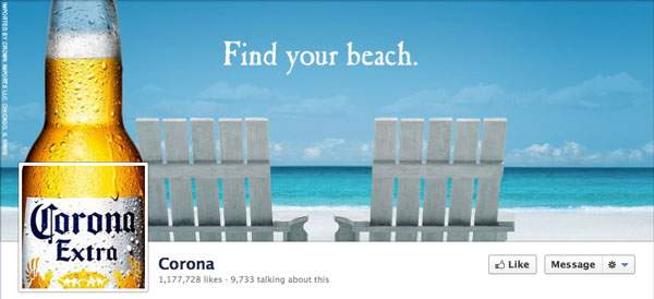
Here some brand Timelines I think do a good job projecting their brand, either with evocative or explicit imagery:
National Geographic evokes adventure, both on Earth and in the cosmos.

Nike uses humor to reach out to the unfit masses!

I like the elegance and simplicity of the Tiffany & Co. Timeline (but the Profile Pic, when sized at 32 x 32px, becomes illegible!).

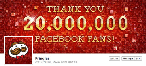
Pringles takes the opportunity to thank their fans (always a good idea), and they also integrate the Profile Pic and Cover Photo to appear part of one big image (more examples of that later on):
What you CAN’T do on your Timeline Cover Photo
Facebook restricts what a Page’s Cover Photo may contain. Specifically:
- Price or purchase information, such as “40% off” or “Download it at our website”
- Contact information, such as web address, email, mailing address or other information intended for your Page’s About section
- References to user interface elements, such as Like or Share, or any other Facebook site features
- Calls to action, such as “Get it now” or “Tell your friends”
My hunch is that this is as much about “encouraging” Pages to utilize Facebook advertising for promotions (instead of your Cover Photo) as it is about keeping Facebook’s overall look tidy and, well, not like the messy MySpace. Cover Photos jammed with messaging and advertising degrades the user experience and thus reduces traffic to Pages. However, as I’ll describe below, there are new features will compensate for this.
Your can read the HyperArts article “Are You Breaking the Rules?” to see examples and discussion.
Your Profile Picture — Keep it Simple
Besides being the square image that is inset at the lower left of your Cover Photo, your Profile Picture is also reduced to 32 x 32px to function as your icon when you post on your Page or comment on other Pages.
So make sure your Profile Picture, which renders at 160 x 160px (plus a 5px white border) as the inset with the Cover Photo, also makes sense at 32 x 32px.
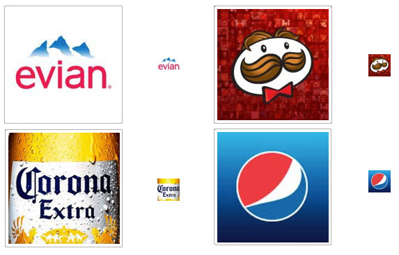
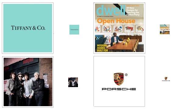
Here are some good and not so good examples of effective use of the Profile Picture. The good ones scale down to 32 x 32px fine; the not so good become illegible and meaningless smudges.
Examples of effective use of the Profile Picture
Examples of poor use of the Profile Picture
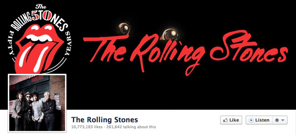
The Rolling Stones! You’d THINK they’d do it right!
The Official Rolling Stones Facebook Page looks pretty good at first glance, but if you look at it from the perspective of this article, it isn’t as effective as it could be.
Having the iconic “lips & tongue” logo in the Cover Photo and a small photo of the band for the Profile Picture is pretty much ass-backwards! That Profile Picture, when scaled to 32 x 32px, is just a vague smudge.
Now, if they’d asked me how to do it, I would have suggested keeping all the same elements, but using them differently….
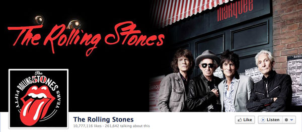
Then, instead of an icon that looks like this:
![]()
You get an icon that looks like this (tiny but still identifiable!):
![]()
Integrate your Profile Picture and Cover Photo
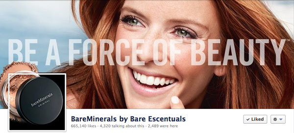
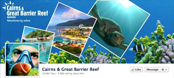
A number of brands have taken a more integrated approach with their Profile Picture and Cover Photo, creating a background continuity that makes the two images feel like a combined whole.
Here are some great examples of the integrated approach:
Bare Minerals by Bare Escentuals
Fanta (and it’s 3D!)

You can read my HyperArts article on creating a cool Profile Picture / Cover Photo integration, and download a Photoshop template to make it quite easy.
Your Custom Tab Images — Design Consistency and Clarity
Finally, we come to the Custom Tab Images, those 1-4 buttons for which you can create custom images, EXCEPT for Facebook’s own Apps (Photos, Notes, Events, Videos, Links).
A Page can have up to 12 apps, with 4 appearing below the Cover Photo and up to an additional 8 revealed by clicking on the arrow to the right of the tabs (the arrow displays the number of hidden tabs). The image dimensions are 111w x 74h pixels.
Strive for Design Consistency with your Brand
The best approach is to have visual consistency on the tab/buttons.
Here are some examples:
National Geographic displays only 2 tab icons. The “About” content will take up extra space provided by using less than the maximum 4 allowed.

Pringles uses a consistent look to the images, and augments them with a descriptive caption/title. (NOTE: You can edit the displayed title of your apps via your admin panel: apps > Edit settings)

Autodesk Inventor goes for a textured text-based image, augmented by the title.

Manchester Libraries uses photography that’s clarified by the titles.

I think you get the idea. It’s all about creating a beautiful Facebook Page that effectively conveys the purpose and quality of your brand.
Feel free to post what you feel are good examples of the Timeline masthead.
This is a guest post by Tim Ware, owner of HyperArts, a Web shop that specializes in WordPress and Drupal CMS, Facebook Tab development, and SEO. You can follow Tim on Twitter or on Facebook.



Really found this useful – many thanks for sharing.
Thanks Karen. I’m glad you found it useful!
What a great collection of examples! I will enjoy sharing this with clients who ask about Facebook cover photo examples. Thank you!
Thanks for sharing your insights and design quality with us. I plan to go to work right now changing my fan page.
What a lovely collection of examples!
I will enjoy sharing this with friends
who ask about Facebook cover photo
examples. Thank you my lovely and peaceful sister Florentina istrati. Much love
Just what I was looking for! Some actionable information that isn’t just a regurgitation of what I found everywhere else. Great read and solved several of my FB page problems. Thanks.
This was really fun to look at.
I totally agree with you that the cover photo image makes the first impression, so we should take the most advantage of that space.
Excellent examples! I love it…thanks for the education. Loved what you would do with the Rolling Stones!
This is a great post with great examples. I was so inspired, I redesigned my custom tab buttons on my Facebook Timeline Page. Thank you! Keep ’em coming!
Great article, very visual and understandable.
How do i create a facebook page
Thank you for this excellent article!
Thank you for sharing. These are great examples that illustrates your
article. This is exactly what I need.